
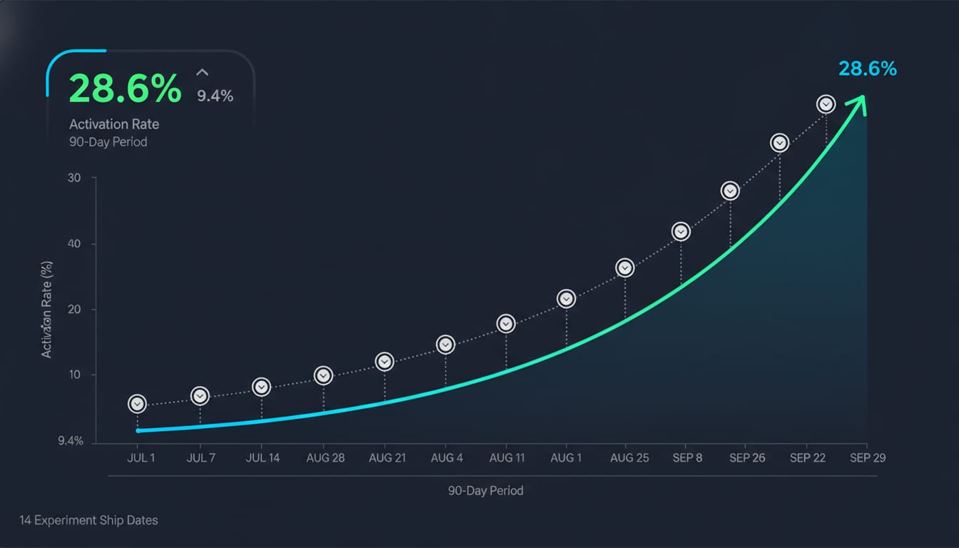
The short version: A Series A B2B SaaS client came to us with a 9.4% activation rate — the percentage of signups who reached their "aha moment" within 14 days. Ninety days and 14 shipped experiments later, activation sat at 28.6%. Three experiments drove 81% of the lift. Six failed outright. Two shipped and were rolled back. That ratio is the point of this article.
If you're evaluating whether an embedded growth pod actually produces results — or whether your in-house team could hit the same numbers with better process — this is the full teardown: the diagnostic, the prioritization calls, the experiments that worked, the ones that didn't, and what we'd do differently.
The Starting Point: A Traffic Problem That Wasn't a Traffic Problem
The client was a workflow automation platform for mid-market operations teams. ~$2.1M ARR, self-serve motion with a sales-assist tier, 1,400 monthly signups from a mix of paid search, content, and a healthy G2 presence.
Their stated problem: "We need more signups."
Their actual problem: they were pouring 1,400 signups a month into a product where fewer than 1 in 10 ever built a working automation. Every incremental dollar of acquisition spend was subsidizing churn. Their blended CAC was $840; their payback period was 19 months against a target of 12.
This is the most common misdiagnosis we see. Founders feel the pain at the top of the funnel because that's where the dashboard lives. But when activation is under 15% in a self-serve product, acquisition spend is the least efficient lever available. OpenView's SaaS benchmarks put median PLG activation rates in the 25–35% band depending on definition strictness — this client was less than half of median.
Defining Activation Before Touching Anything
Week one was not an experiment. It was a definition fight.
The team had three competing definitions of "activated" floating between the product dashboard, the marketing report, and the board deck. We ran a correlation analysis across 11 candidate in-product actions against 6-month retention, using 18 months of historical cohort data.
| Candidate activation event | 6-month retention (users who did it) | 6-month retention (users who didn't) | Lift |
|---|---|---|---|
| Created an account | 11% | — | baseline |
| Invited 1+ teammate | 34% | 14% | 2.4x |
| Connected 1 integration | 29% | 15% | 1.9x |
| Built + ran 1 automation successfully | 61% | 9% | 6.8x |
| Viewed 3+ template pages | 19% | 17% | 1.1x |
| Completed profile | 16% | 17% | 0.9x |
"Built and ran one automation successfully, within 14 days" became the single activation metric. Everything downstream — prioritization, dashboards, weekly reporting — pointed at that number. Baseline: 9.4%.
That table is the single most valuable artifact from the entire engagement. Without it, you're optimizing proxies. We've written more about instrumenting this correctly in our guide to building an experiment-driven growth machine, but the mechanic is simple: find the behavior that predicts retention, then make more people do it faster.
The Diagnostic: Where 90.6% of Signups Died
We instrumented the full signup-to-activation path with event tracking in week one — a two-day engineering job that had been on their backlog for seven months. Here's what the funnel looked like:
| Step | Users | Step conversion | Cumulative |
|---|---|---|---|
| Signup completed | 1,400 | — | 100% |
| Reached workspace | 1,342 | 95.9% | 95.9% |
| Started onboarding wizard | 786 | 58.6% | 56.1% |
| Connected first integration | 341 | 43.4% | 24.4% |
| Opened automation builder | 298 | 87.4% | 21.3% |
| Published an automation | 187 | 62.8% | 13.4% |
| Automation ran successfully | 132 | 70.6% | 9.4% |
Three leaks stood out:
- 41% never started onboarding. They landed in an empty workspace with a dismissible tour and left.
- 57% who started onboarding died at integration connection. OAuth flows for their four most-used integrations had a combined 43% completion rate. Session recordings showed users hitting permission-scope screens they didn't have admin rights to approve.
- 29% of published automations failed on first run — silently, with an error surfaced only in a logs tab most users never opened.
That third one is important. It wasn't a marketing problem, a copy problem, or a design problem. It was an engineering reliability problem sitting inside the activation funnel. This is precisely why we don't separate growth marketing from growth engineering: the biggest activation leak in this product was a bug class, and no amount of A/B testing headlines would have found it.
Prioritization: How 14 Experiments Got Chosen From 63 Ideas
We ran a two-hour ideation session with their product lead, two engineers, their head of marketing, and our pod. Output: 63 raw ideas. We scored them using our 4-Phase prioritization approach rather than a flat ICE score.
The difference matters. ICE and RICE score ideas in isolation. Our framework scores them against funnel-stage leverage — how much of the remaining leak an experiment can theoretically address — which prevents the classic failure mode of shipping ten clever tests against a step that only 4% of users reach.
Here's the filter we applied, in order:
- Phase 1 — Diagnostics: Does this target a measured leak of >10% of the cohort? (Killed 31 ideas.)
- Phase 2 — Measurement: Can we detect the effect at our traffic volume in under 3 weeks? (Killed 14 more.)
- Phase 3 — Conversion: Is the mechanism plausible given what session data and support tickets tell us? (Killed 4.)
- Phase 4 — Scale: If it works, does it compound or does it need permanent maintenance? (Deprioritized 0 at this stage, but reordered 6.)
That left 14 experiments, sequenced across 12 weeks. If you want to sanity-check your own numbers, the experiment velocity math is unforgiving: at 1,400 monthly signups and a baseline of 9.4%, we needed roughly 1,100 users per variant to detect a 3-point absolute lift at 80% power. That capped us at one primary split test at a time plus non-conflicting sequential ships.
Velocity constraint, stated plainly: 14 experiments in 90 days is roughly 1.2 per week. That is not a vanity number — it's the maximum honest throughput at their traffic level. Anyone promising 40 tests a quarter on 1,400 signups a month is either running underpowered tests or lying.
The 14 Experiments: Every Result, Including the Failures
| # | Wk | Experiment | Funnel step | Result | Abs. activation impact |
|---|---|---|---|---|---|
| 1 | 2 | Replace empty workspace with pre-built template gallery | Onboarding start | Win | +2.1 pts |
| 2 | 2 | Remove profile-completion step from signup | Signup → workspace | Flat | 0 |
| 3 | 3 | Fix silent automation-failure errors + inline retry | First run success | Win | +3.4 pts |
| 4 | 4 | Social-proof sidebar ("2,840 teams use this template") | Onboarding start | Flat | 0 |
| 5 | 4 | Reduce OAuth scopes to minimum viable per integration | Integration connect | Win | +6.8 pts |
| 6 | 5 | "Invite your admin" flow for non-admin signups | Integration connect | Win | +1.9 pts |
| 7 | 6 | Onboarding video instead of interactive checklist | Onboarding start | Loss (−1.4) | rolled back |
| 8 | 7 | Sandbox mode: build an automation with fake data first | Integration connect | Win | +2.2 pts |
| 9 | 8 | Day-1 / day-3 / day-7 behavioral email sequence | All | Win | +1.7 pts |
| 10 | 9 | In-app AI assistant that drafts automation from plain English | Builder → publish | Win | +2.4 pts |
| 11 | 10 | Live-chat proactive trigger on builder page | Builder → publish | Flat | 0 |
| 12 | 10 | Pricing page interstitial before workspace | Signup → workspace | Loss (−2.8) | rolled back |
| 13 | 11 | Reduce required fields in automation builder from 7 to 3 | Publish | Flat | 0 |
| 14 | 12 | Slack/email activation nudge to invited teammates | All | Flat | 0 |
Tally: 7 wins, 5 flat, 2 losses (both rolled back). Sum of winning deltas: +20.5 points. Measured end-state: 28.6% (+19.2 points), because effects interact and don't cleanly add.
The Three That Mattered
Experiment 5 — OAuth scope reduction (+6.8 points). The single biggest win in the quarter was not a growth tactic. It was an engineer reading their integration code and realizing they were requesting write access to entire workspaces when the product only needed read access to one folder. Reducing scopes lifted OAuth completion from 43% to 71%, because far fewer users hit the "you need admin approval" wall.
Cost: 9 engineering days across four integrations. No copywriting, no design, no A/B test framework. Just someone senior enough to look at the permission manifest and ask why.
Experiment 3 — Surfacing silent failures (+3.4 points). 29% of published automations failed on first run and told nobody. We added an inline error state with a plain-English diagnosis and a one-click retry. First-run success went from 70.6% to 89%. Again: an engineering fix inside a growth funnel.
Experiment 1 — Template gallery replacing the empty state (+2.1 points). The classic empty-state fix, and the one most teams would have started with. It worked, but it was a third the size of the OAuth win. Had we started here — as a conversion-focused agency likely would have — we'd have shipped the smallest of the three big wins first and spent weeks iterating on gallery layout.
The Two That Backfired
Experiment 7 — Video onboarding (−1.4 points). We replaced an interactive checklist with a 90-second product video. Watch rate was 61%, which looked great. Activation dropped. Hypothesis on the post-mortem: watching is not doing, and the video moved users from action mode to consumption mode at the exact moment momentum mattered. Rolled back in week 7.
Experiment 12 — Pricing interstitial (−2.8 points). The client's sales team wanted a pricing/plan-selection screen before workspace entry to improve lead qualification. We warned it would suppress activation, agreed to test it anyway, and it did — badly. It also produced the most useful political artifact of the quarter: a hard number attached to a sales request. It got rolled back without argument. If you're weighing packaging changes like this, our breakdown of freemium vs. free trial vs. reverse trial covers the tradeoffs more fully.
The Five Flat Results Were Not Wasted
Flat results retired hypotheses. Experiment 4 (social proof) told us trust wasn't the blocker — capability was. Experiment 13 (fewer required fields) told us form friction in the builder wasn't real friction. Experiment 11 (proactive chat) told us users weren't stuck-and-confused; they were blocked-by-permissions, which experiment 5 had already handled.
We at Growaton report flat results with the same prominence as wins in weekly updates. A pod that only shows you winners is either hiding tests or not running enough of them.
The Numbers That Actually Moved the Business
Activation is a means, not an end. Here's the downstream picture at day 90 versus the pre-engagement baseline:
| Metric | Before | Day 90 | Change |
|---|---|---|---|
| 14-day activation rate | 9.4% | 28.6% | 3.04x |
| Monthly signups | 1,400 | 1,455 | +3.9% (no acquisition work) |
| Monthly activated users | 132 | 416 | 3.15x |
| Signup → paid conversion (90-day) | 3.1% | 7.8% | 2.5x |
| Blended CAC | $840 | $840 | flat |
| CAC payback period | 19 mo | 8 mo | −58% |
| Month-3 logo retention | 71% | 84% | +13 pts |
The retention improvement is the underrated line. Because activation was defined against a behavior that predicted retention (6.8x lift, per the correlation table), moving activation moved retention automatically. That's the difference between optimizing a metric and optimizing the right metric.
Total engineering effort across all 14 experiments: 61 developer-days. Roughly 40% of that went to experiments 3 and 5 — the two engineering-heavy wins that together produced 53% of the total lift.
What Made 90 Days Possible (And What Didn't)
Weekly shipping, not monthly reporting
Every Thursday: what shipped, what the numbers say, what ships next. Twelve of those meetings in 90 days. Two of them killed experiments early. That cadence is why experiment 7 cost us one week instead of one quarter — a fortnightly or monthly review rhythm would have let a negative result sit live for 3–4x longer.
One team, no handoffs
The OAuth fix required product judgment, engineering access, and analytics instrumentation. In a siloed setup — agency does the test design, in-house eng gets a ticket, data team builds the dashboard next sprint — that experiment takes six weeks of coordination or never happens. It shipped in nine days because the same pod owned all three. We've compared the agency vs. embedded pod vs. in-house tradeoffs in detail, and activation work is the clearest case where the integrated model wins outright.
AI where it saved real hours
Two places AI meaningfully compressed the timeline. First, session-recording triage: we ran transcripts and event sequences from ~600 dropped sessions through an LLM classification pass to cluster failure reasons, which took an afternoon instead of a week of manual review. That's how the admin-permission pattern surfaced by day 6. Second, experiment 10 itself was an LLM feature — plain-English automation drafting — which shipped in 11 days and added 2.4 points.
Where AI did not help: hypothesis quality. Every one of the three big wins came from a senior human looking at data and asking a skeptical question. AI accelerated the grunt work around the thinking, not the thinking. That's the honest version of "senior builders at AI speed," and it's the same conclusion we reach in our work on proving LLM spend actually pays back.
What we'd do differently
- Instrument before ideating. We ran the funnel instrumentation in parallel with the first ideation session. Two of the 63 ideas were dead on arrival because they targeted steps that turned out to be fine. Sequence it properly and you save a session.
- Test the sales request earlier. Experiment 12 sat in the queue until week 10 because we knew it would lose. Running it in week 3 would have removed a recurring internal debate seven weeks sooner.
- Cap concurrent variants harder. We briefly ran experiments 9 and 10 with overlapping audiences and had to extend both by five days to untangle attribution. At 1,400 signups a month, sequential beats clever.
Is This Replicable, or Did We Get Lucky?
Partly lucky. A 3x is only available when the baseline is broken. If your activation rate is already 30%, you are not getting a 3x — you're fighting for 3–5 points per quarter, and the work is harder.
Here's a rough honest range from our engagements and published PLG benchmarks:
| Starting activation | Realistic 90-day outcome | Where the wins come from |
|---|---|---|
| Under 12% | 2–3x | Broken mechanics: auth, errors, empty states |
| 12–20% | 1.4–1.8x | Onboarding sequencing, time-to-value compression |
| 20–30% | +3 to 6 pts | Segment-specific paths, lifecycle messaging |
| Over 30% | +1 to 3 pts | Long-tail personalization, pricing/packaging |
The replicable parts, regardless of where you start:
- Define activation against measured retention correlation, not intuition.
- Instrument the full funnel before generating ideas.
- Prioritize by funnel-stage leverage, not by idea-level scores.
- Give the same team product, engineering, and data authority.
- Ship weekly, report flat results, roll back losses fast.
- Cap your test count to what your traffic can actually power.
Most teams fail on step 1 or step 4. Step 1 is a two-week analysis problem. Step 4 is an org-design problem, and it's the reason activation projects stall in companies that have all the right people in all the wrong reporting lines.
Where to Go From Here
If your activation number is under 20% and your CAC payback is over 12 months, you almost certainly have a version of this problem — and it's a better place to spend the next quarter than another acquisition channel.
Two useful next steps:
- Run the diagnostic yourself. Pull the retention correlation table for your top 10 in-product actions. It takes a competent analyst about a week. If one action shows 4x+ retention lift, that's your activation metric.
- Or have us do it with you. A free growth diagnostic conversation is 45 minutes where we look at your funnel numbers and tell you where the leak is. No deck. If the leak isn't worth fixing, we'll say so.
You can see more teardowns like this one in our case study library, or review how pod engagements are scoped and priced if you'd rather skip to the commercial question.